Advances in technology and user experience continue to skew the
lines between virtual and reality. Social media has us overloaded with messaging, opinions and “facts,” and our human kinesthetic senses
crave tactile and tangible connection.
Overall 2017 design trends are at times both futuristic and optimistic while also being nostalgic and time-tested:
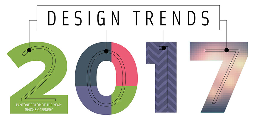
BOLD COLORS AND TEXTURES
While flat design is still a powerful concept, it’s become saturated. Introducing additional color and texture helps eschew the machine-made appearance. Bold colors and texture are popping up everywhere from editorial layouts, to brand design, posters and book covers. Consider adding:
• Bright colors (duotones, fluorescents, pastels)
• Geometric and layered shapes (like low-poly – an angular, faceted look popular in video game design)
• Patterns and texture (like botanicals and natural/organic shapes)
MODERN RETRO TYPEFACES
This style has influences ranging from art-deco, to mid-century modern, and recently style references from the 80s and 90s. Typefaces, both serif and sans serif, are mixed with modern color palettes, elements of flat design, or negative space allowing imagery to peek through. Use this trend and theme your typography around the subject of a feature article.
COLLAGE-INSPIRED DESIGNS
What’s old is new again. Collages are enjoying a moment in the sun. While used heavily throughout the 90s, they impart a 3D effect when used in print collateral and can really help join several disparate elements, or allow you to enhance simple imagery with texture, shape and color.
MINIMALISM
The focus on simplicity and functionality has led to its adoption by many brands. Intentional white space means more breathability, reduced focal points and a simplified presentation.
MODULAR LAYOUTS
Continuing the minimalist trend, and probably reflective of the prominent illustrations used to explain complex problems or instructions, modular layouts are focused on making dense information as accessible and digestable as possible. Breaking this content into chunks of information is easier for the viewer to comprehend.
MAGAZINE LAYOUT AND DESIGN TRENDS
• Wrapping text around images in unusual ways
• Aerial photography to bring a different perspective to your story
• Layering Text and image(s) to give the effect of 3D
• A well-designed contents page can serve as a style sheet for the rest of the magazine; make sure it grabs your readers attention
• Consider using typography in a bold statement to offset your feature story
PRINT DESIGN TRENDS
• Foil stamping, spot varnishing, embossing/debossing, die-cuts, etc. Consider adding a special finishing technique to bring another tactile element to your print design.
• Connect your printed piece with audio and/or video content. Many apps, like Layar, allow readers to scan images within your printed magazine which will launch audio or video content. At times this segue can be distracting, so be discerning in your choices.
• Uncoated vs. coated papers. While each has its merits and appropriate applications, uncoated papers have been trending. Available in a variety of finishes and colors, uncoated papers lend themselves to a more tactile appearance and can promote a simple design to an outstanding design.


16 - 17
<
>
Copyright © 2020 Academy Graphic Communication, Inc. All rights reserved.